With the opening game of the 2022 FIFA World Cup at the Al-Bayt Stadium in Qatar on Nov. 20 getting ever closer, the 32 teams are finalising the kits they will be wearing on the pitch.
We've already seen some incarnations from Adidas and Puma, the latter having caused a bit of a storm with its insistence on sticking to an overarching concept for all of its alternate jerseys.
But can Nike do any better? The giant sportswear brand has announced home and away kits for a host of teams, including big hitters such as France, Brazil, Portugal, Netherlands and the U.S.
Having sifted through the designs on show, there are undoubtedly some instant hits among the bunch. However, it should perhaps also be said that every nation involved hasn't been quite so lucky in the sartorial stakes.
Here we run through the plethora of new kits released this week, along with a brief breakdown of each individual design and a no-nonsense "hit" or "miss" rating.
United States
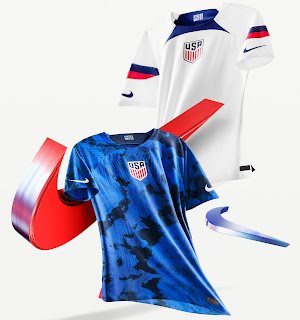
Home: A white jersey, but some of the most memorable ones of the past have been, in effect, plain white shirts. This loses marks for the central crest, which just makes the whole thing OK. But nothing more.
Away: Tie-dye and stone washing. This is what has everyone so riled up. It's awful.
France
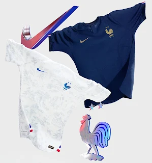
Home: Sleek and minimal but just far too plain to inspire any particular emotional response either way. The combination of navy blue and gold trim gives a faint regal air but the reigning World Cup champions certainly deserved more.
Away: All the hallmarks of a standard France away shirt are present thanks to a white shirt with blue trim and just a hint of tricolour sprinkled here and there. On closer inspection, the jersey also bears an all-over print inspired by traditional "Toile de Jouy" fabric with selected images including the Gallic cockerel symbol, the Arc de Triomphe and the national training centre at Clairefontaine.
Rating: HIT
Portugal
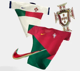
Home: The diagonal split across the front of the shirt is supposed to mimic a Portuguese flag being wrapped around the player's body.
Rating: HIT
Away: Sail White on the away kits ensures the Portuguese one stands out in a sea of bright white kits.
Rating: HIT
Brazil
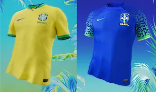
Home: While every inch the traditional Brazil kit, the latest incarnation of the famous yellow jersey comes embellished with an unusual print pattern inspired by the fur of the jaguar -- the unofficial national animal of the country. Classic and contemporary all in one fell swoop.
Rating: HIT
Away: The jaguar theme continues onto the away kit though with less convincing results as the lurid neon green sleeve graphic clashes awkwardly with the blue base colour. Certain to divide opinion, but we feel it's just missed the mark.
Rating: MISS
Netherlands
Home: The specific shade of Oranje used for Netherlands' latest World Cup kit has been dialled down somewhat to create a burnished, almost amber colour though the tie-dye tiger-stripe print only serves to make the shirt look permanently creased.
Rating: MISS
Away: A dull template kit in blue, black and red that encapsulates precisely none of the nation's rich World Cup heritage. The kind of football shirt that just instantly fades from memory.
Rating: MISS
Croatia
Home: The 2018 World Cup finalists have seen their red and white checks given yet another modern update as the famous block print is broken up in places. Nothing revolutionary going on here but Croatia still look like Croatia and that's definitely a good thing.
Rating: HIT
Away: The away kit has a blue and teal check design that is obscured using blurred lines and swirling graphical glitches here and there. While admirably different, the result is a jersey that somehow looks half-finished.
Rating: MISS
Australia
Home: While fairly plain at first glance, the Australia home kit is intended to evoke the country's unique landscape and ecosystem with the mottled, jagged golden pattern intended as a homage to the rugged terrain of the Outback.
Rating: HIT
Away: Also inspired by nature, the deep blue away shirt was created to represent the oceans that surround Australia. The rippled pattern creates a clever tidal effect while the marine-coloured trim hints at the biodiversity found beneath the waves.
Rating: HIT
Qatar
Home: Desert Maroon has been used with white serrated trim to mirror the Qatari flag, but this isn't the standout performer the hosts of the World Cup could have done.
Rating: MISS
Away: This kit brings out the coastline of Qatar, while "a subtle string of pearls graphic overlay nods to the history of pearl-diving in the coastal atolls." A bit of history and meant to mimic a sandstorm. Cool.
Rating: HIT
Saudi Arabia
Home: Predominantly white with green accents and a palm leaf pattern that was first seen on 2020 away kit. Not too original.
Rating: MISS
Away: A tonal green pattern which covers the entire front, sleeves and back. Unusual and pretty decent.
Rating: HIT
Poland
Home: Poland never seems to get treated to interesting kits, and their 2022 vintage is no different, with the home strip limited to a very straightforward design in the national colours of red and white. The retro crew collar and sleeve cuffs are fairly nice in isolation though.
Rating: MISS
Away: A little more imagination is evident on the away shirt thanks to a crackled print design spread across the shoulders and down the sleeves. Other than that, it's basically just a straight colour reversal of the home jersey.
Rating: MISS
Canada
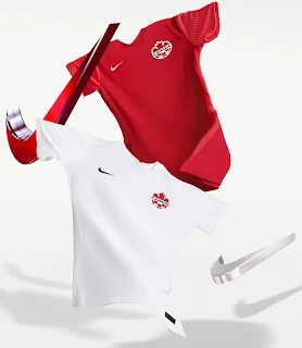
Canada's current kits debuted in a June 2021 World Cup qualifying match against Aruba, and they won't get a new one for the World Cup due to being "on a different kit development cycle."
Home: A plain red football shirt with the Canadian maple leaf crest on the chest.
Rating: MISS
Away: A plain white football shirt with the Canadian maple leaf crest on the chest
Rating: MISS
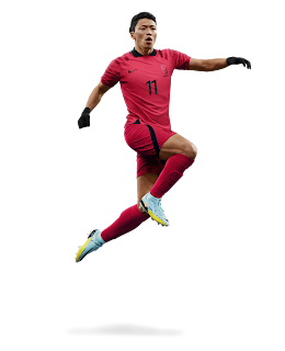
South Korea (Home)
Home: The South Korean home kit is based on the ancient mythical folk tales of Dokkaebi, mischievous goblins who both help and hinder their human counterparts. Just to cap it all off, the fiery crimson colour palette represents the fighting spirit of the nation.
Rating: HIT
